Challenge
How can I redesign dailycampus.com for improved user-friendliness and to better showcase the contributions of The Daily Campus staff?
Context
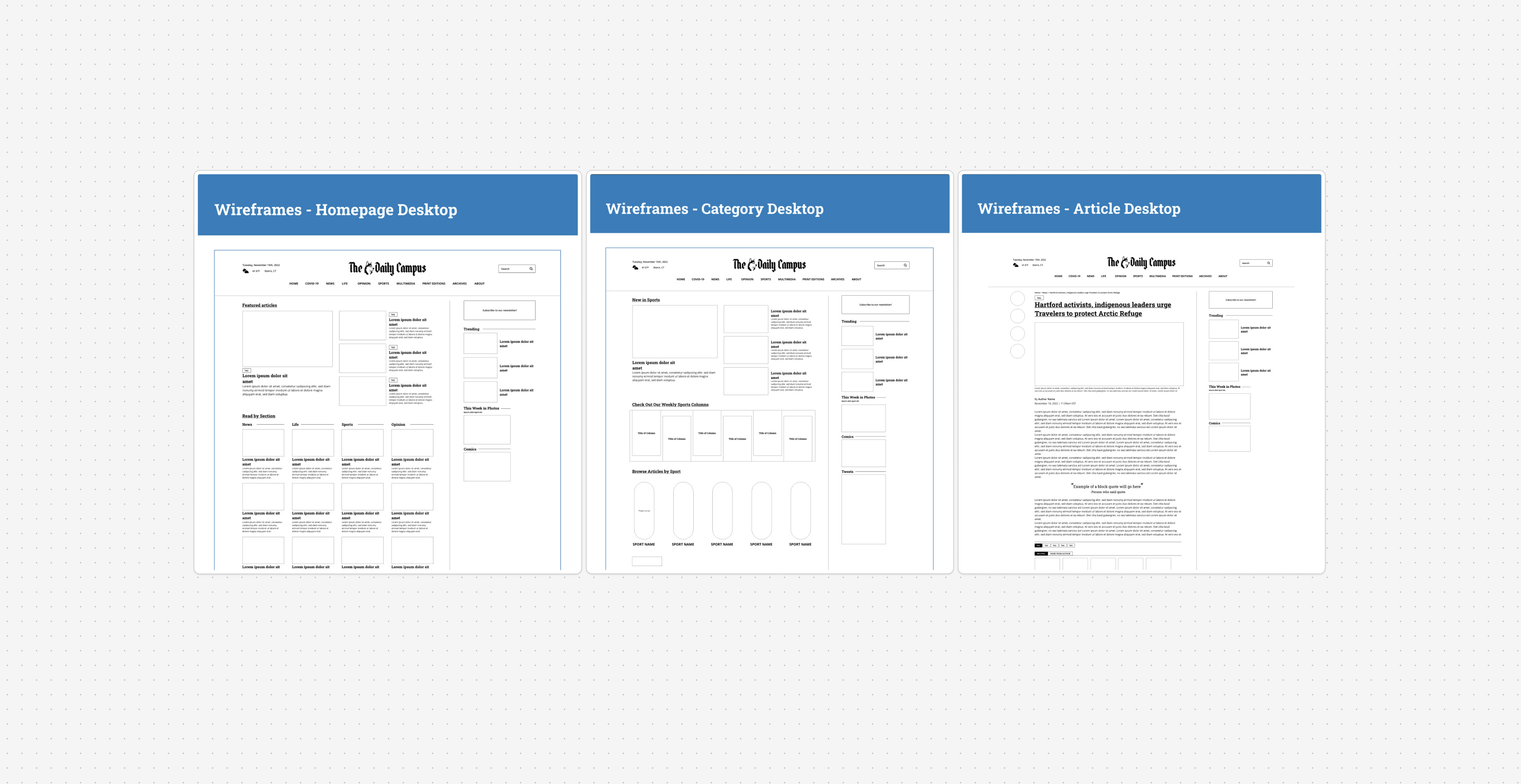
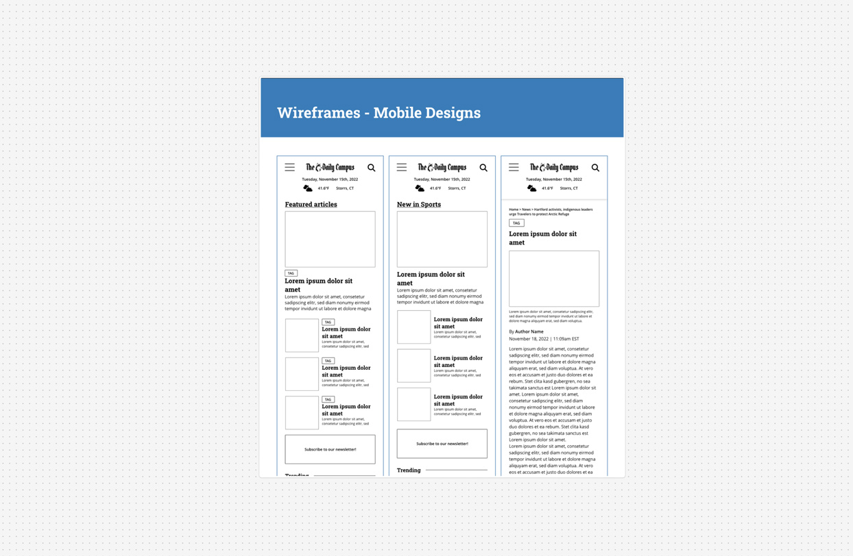
This final project was created for DMD 2470 - User Interface Design. I was tasked to design and make a light Adobe XD prototype for 3 desktop screens and 3 mobile screens for the home page, category page, and article page of a digital publication. As a digital producer at The Daily Campus at the time, I chose to redesign parts of The Daily Campus website, UConn’s student newspaper.
Action
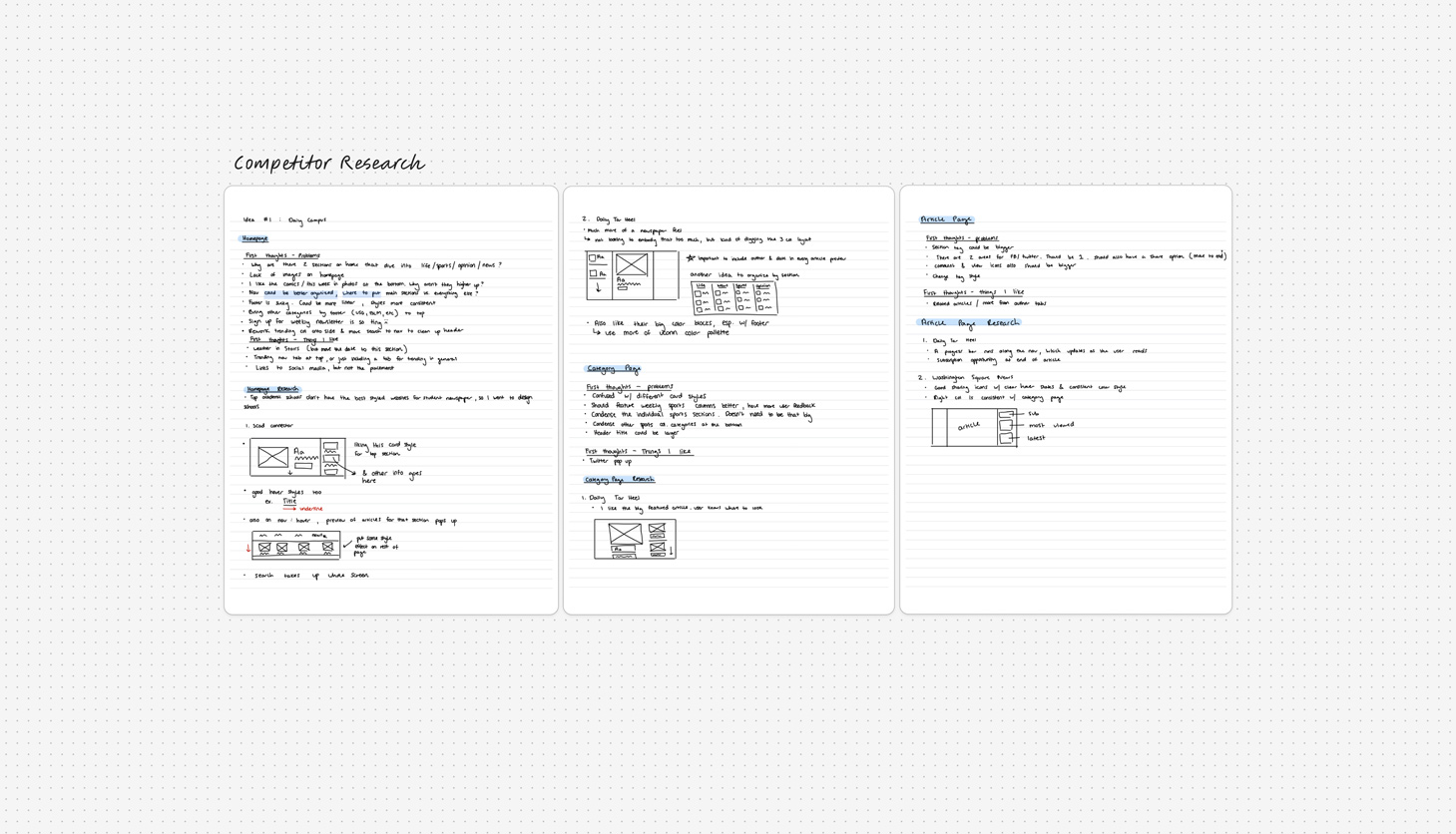
I started by looking into the current Daily Campus (DC) website. I wrote down was I liked and didn’t like about its homepage, category pages, and article pages. After reviewing the current DC website, I went to the digital publications of other schools and took notes and sketches on layouts and practices that worked with their sites. I used The Connector, The Daily Tar Heel, and Washington Square News as references.
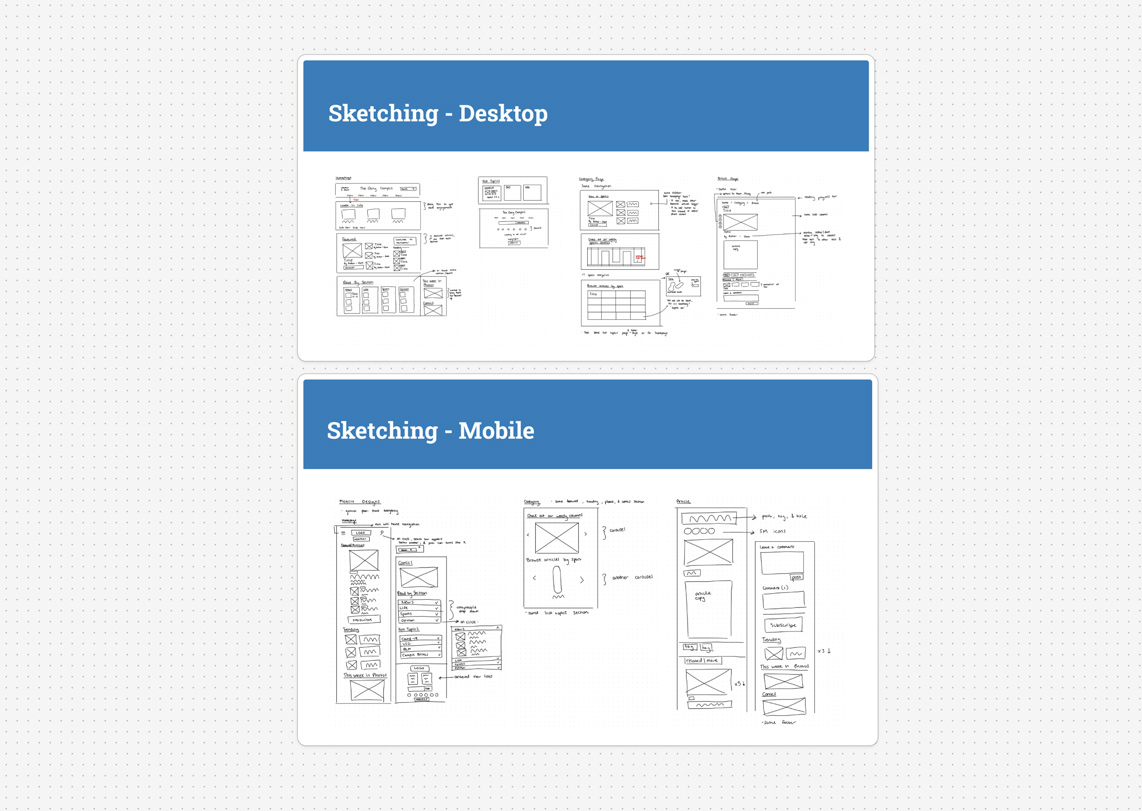
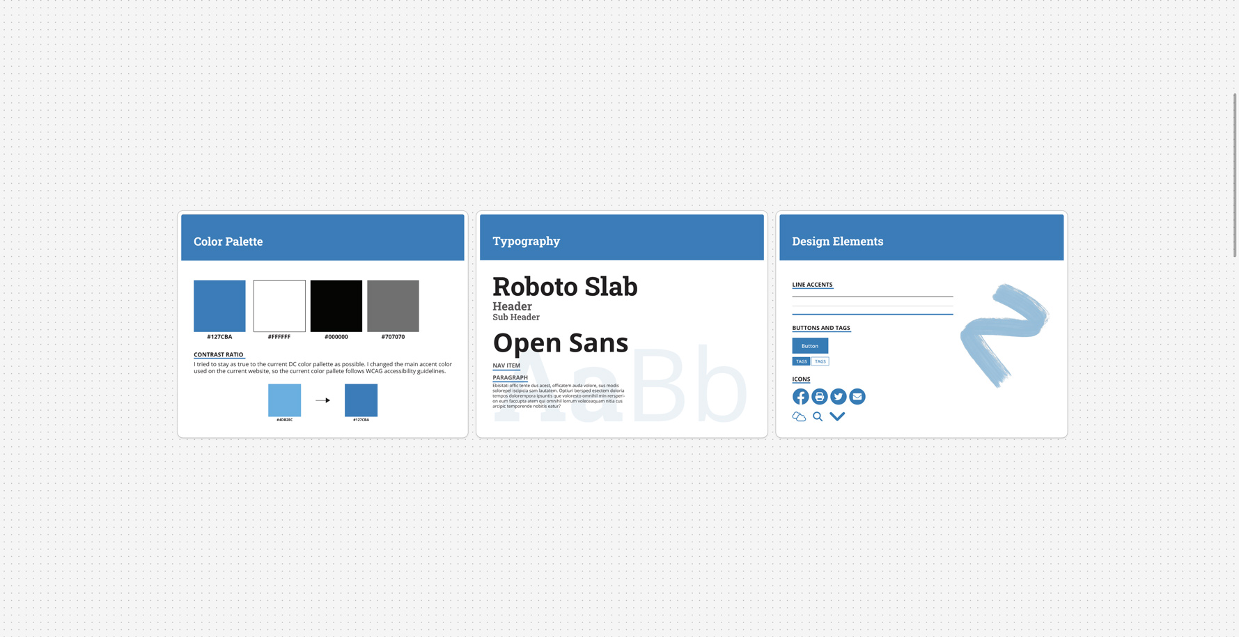
After gathering research, I began to sketch out and design initial wireframes. Before moving onto mockups, I solidified the visual design guidelines for the project: I modified the blue color in The Daily Campus’s color palette to better adhere to WCAG guidelines, selected typography that better suited a news publication, and designed essential button, line, and icon elements. With the design guidelines and wireframes prepared, I finalized the project mockups and light prototypes.
Impact
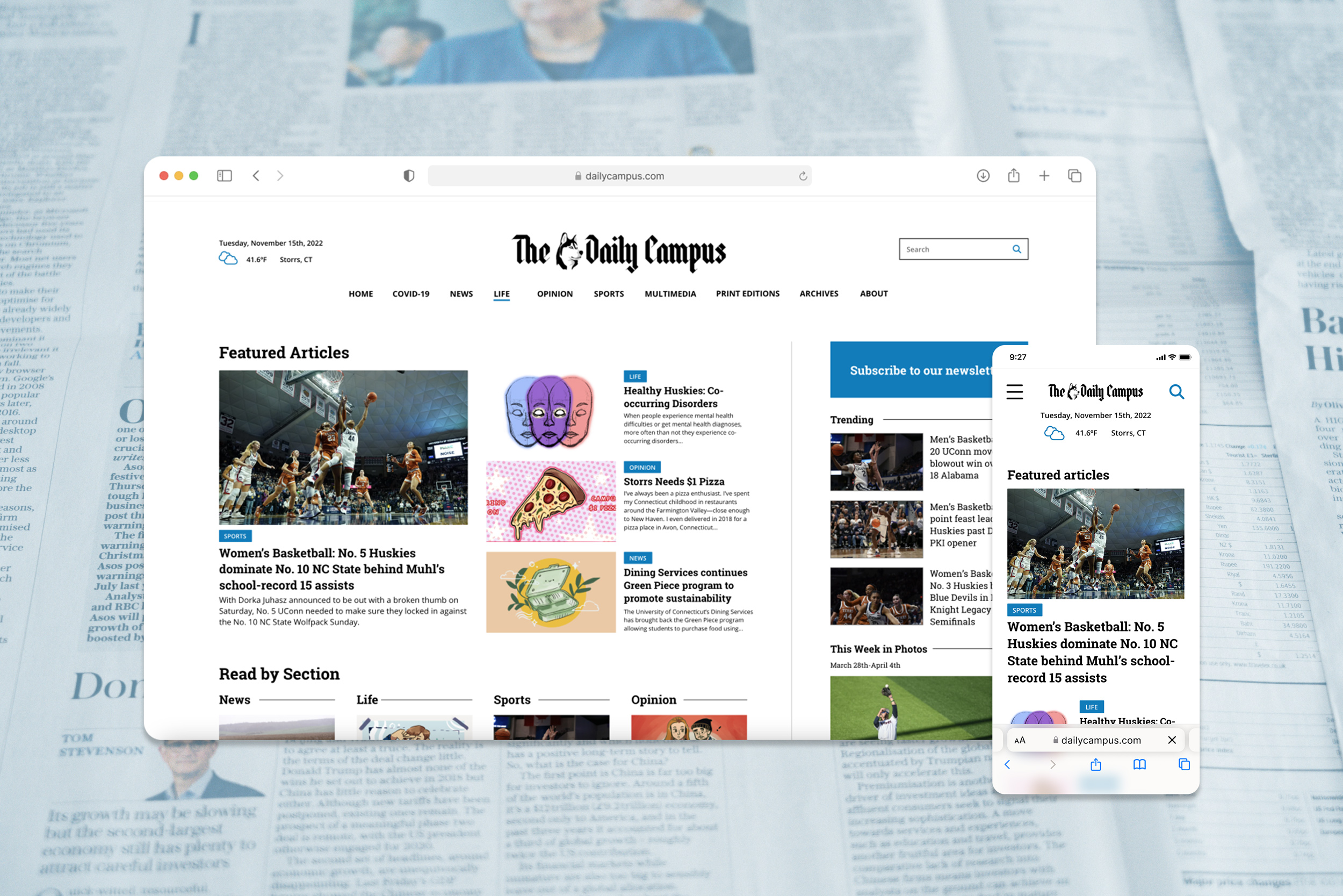
The final Daily Campus redesign highlights: a more engaging homepage, consolidated navigation, an in-view CTA for the newsletter, a cleaner footer design, more organized sports categories, and better representation of trending articles, staff photos, and comics.
