UConn Office of Outreach and Engagement
Challenge
How can I elevate the visual aesthetics and user experience of the UConn Office of Outreach and Engagement website?
Context
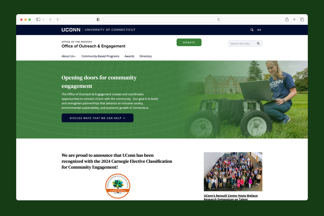
As a student UI/UX designer for the UConn Digital Experience Group, I partnered with UConn’s Office of Outreach and Engagement to elevate their online presence. The initiative was driven by the need enhance the site’s user interaction and to better represent the Office’s commitment to community outreach. This project resulted in a design audit, light refreshes to their website, and the start of developing two new pages on their site: a community based programs map and a staff scholar directory.
Action
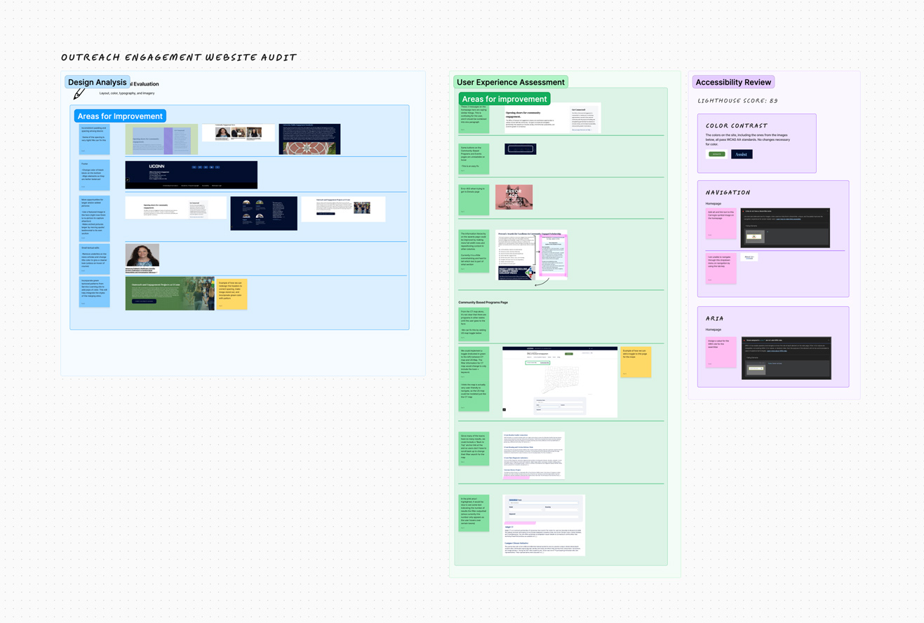
I first started the design process by conducting an audit of the site. Using FigJam AI to help with organization, I organized the audit by 3 area evaluations: design/visual, user experience, and accessibility. This audit allowed me to prioritize issues and start editing the live site.
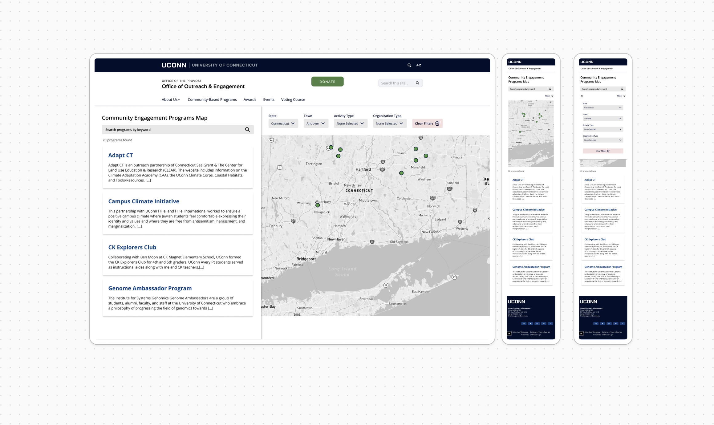
My next step was to create mockups in Figma for the new community programs map. After meeting with the clients and reviewing the current programs map, I decided to make the map more interactive. The previous map was a static map of Connecticut, and the proposed one is draggable, zoomable, and can support programs outside of Connecticut. Additionally, with more search and filter options, the new map concept helps users find the right programs for them.
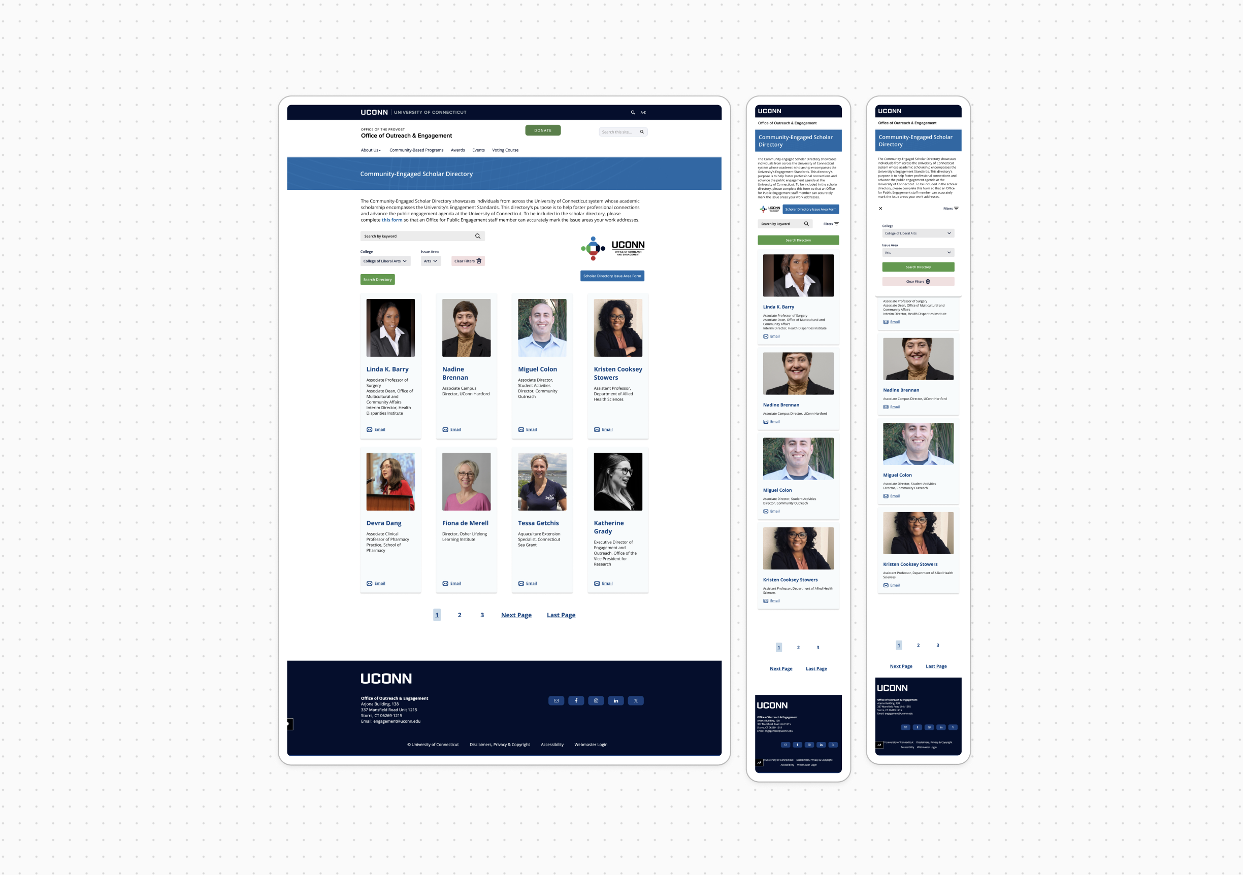
Lastly, I put together mockups for the scholar directory page. With search filters by keyword, college, and issue area, the introduction of this page to the site aims to foster professional connections within UConn.
Impact
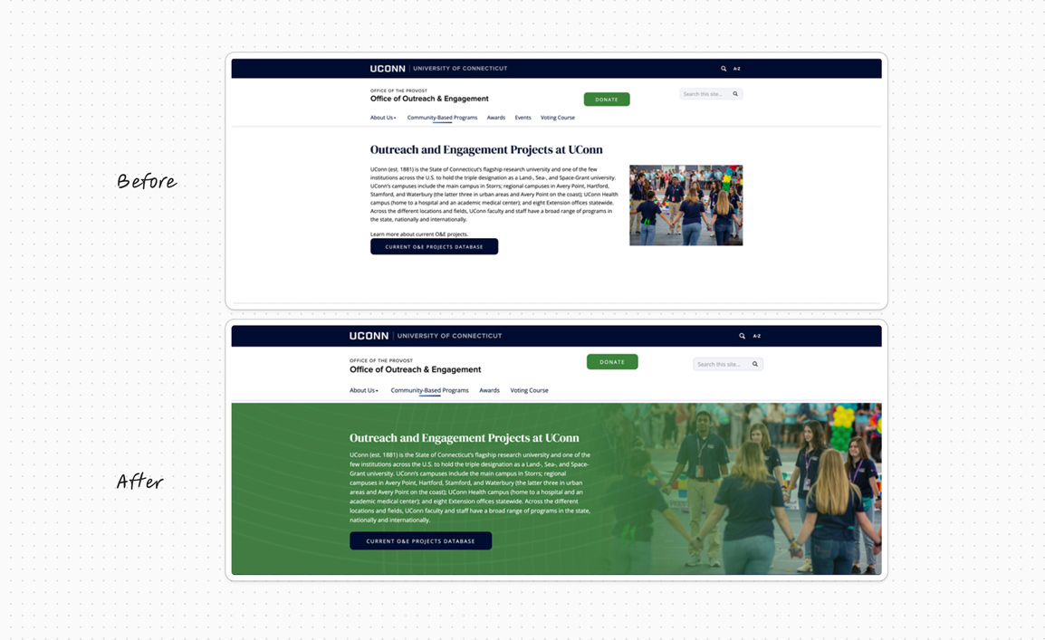
The Office of Outreach and Engagement’s website was elevated through redesigned hero banners, micro interactions, and reorganized copy and content. To progress in the design process, I was able to hand off to the development team the mockups and prototypes for the community based programs map and the staff scholar directory.

